
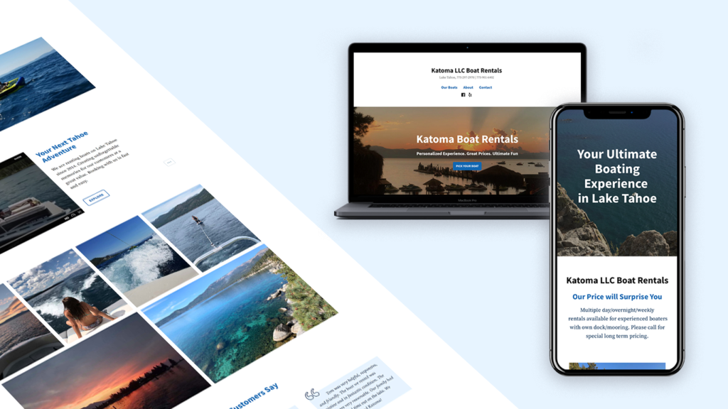
Katoma Boat Rentals LLC
A responsive website for booking your next boat experience
Background
Katoma Boat Rentals needed a simple and responsive website to promote their services in South Lake Tahoe, CA, as well as to provide a way to get contacted by their clients.
The Challenge
They said that they didn’t want the users to book through their website. They wanted the user to contact them to make the booking.
Since many users tried to book their vacation online, Katoma’s website should present the necessary information so the users feel confident and compelled to make the booking through a phone call.
The Goal
Design a responsive website (desktop, tablet, and cellphone) that covers their main functionality: choose a boat and service of their preference and contact the company.
Role
Product Designer & UX/UI designer
Software
Figma, Photoshop & Illustrator
My Design Process
- Secondary Research
- Competitor Analysis
- Interviews
- Usability testing
- Persona
- User Flow
- Sketches
- Wireframes
UI design wireframes
Usability testing
Research
To define the goals of the research I asked myself these questions:
- What are the issues that people face when booking a trip online?
- How to make the process of booking a flight online a more enjoyable experience?
- How can Katoma motivate users to call them to make a booking?
- Are promotions and key features visible to the users on their website?
Research Methodologies
Competitive Analysis
Katoma’s direct competitors include Marina’s Boat Rentals, Tahoe Wakebusters, Water Wave Group, and Tahoe sports.
- Some of the competitors offer wakeboarding, waterskiing, and wake surfing.
- Users can book through their website.
Secondary Research Findings
The market
Boat rentals use getmyboat.com to list their services as well as yelp.
COVID19
Even though the pandemic affected the vacation rental business. There was an increase in outdoor activities in South Lake Tahoe which had a positive impact on this type of business.
Interview Findings
I Interview 3 participants that book flights online 2 to 3 times a year. They love traveling.
Goals
- To get the best price on boat rentals
- Users want information about the services
- They would like to see reviews about their services
- Not being able to book online
- Have to pay extra for any added on
- Free cancelations
- Short lengths of layovers
- Package deals that include a car rental and/or hotels
- Vacation packages deals
- Reward’s program
- Promotional deals
- Recommendations on popular destinations and activities to do
Define
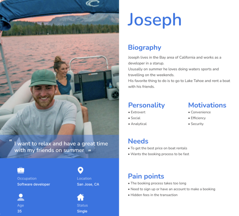
Based on my research I created a persona that represents the target user of Ryanair.
Persona
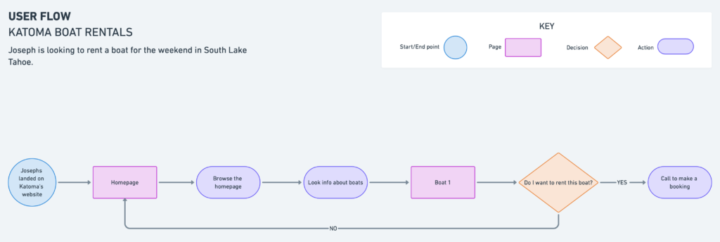
User flow
Through the user flow I could identify that the booking process made the user to make many decisions, and navigate through many pages before letting her to check out.
What comes next?
Knowing my target user, their needs and pain points as well as Ryanair’s website issues, I started to think about the opportunities that came up with the research to improve Ryanair’s user experience and start thinking of the solutions.
Ideation
How might we questions
- How might we ensure that customers feel motivated and confident to make a booking?
- How might we help people to find their plane tickets easily?
- How might we make the booking process more efficient?
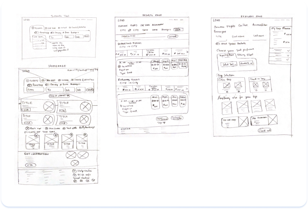
Sketches
Based on these questions I started to sketch out some ideas thinking about my research findings, persona, and user flow.
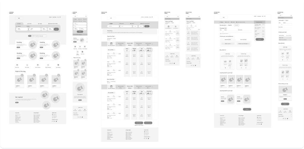
Wireframes
Following my sketches, I created this wireframes.
Design
How might we ensure that customers feel motivated and confident to make a booking?
To appeal the user, I tried to convey an inviting, modern look and feel and at the same time provide an easy and straightforward navigation.
Homepage
For an inspiring look, I let the blue color be predominant. I let the images to speak for themselves and kept the use of color as minimal as possible.I used white space to guide the the user through the content.
The following features were added:
- Brief info about services with CTA buttons
- Video about the experience
- Reviews
- Contact form

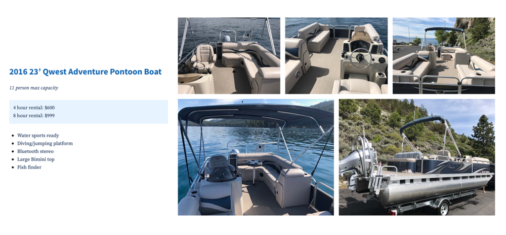
How might we help people to find their boat rental easily?
By presenting prices, photos, and what features are included, the user can make an informed decision to book a boat.
How might we make the booking process more efficient?
Provide a CTA button that allows the user to call the company to make their booking, and a contact form if they want to be contacted and have questions.
Usability Testing and Iteration
I ran a usability test to identify any flaws in the redesign website.
Findings
- Participants were satisfied with the process of booking a travel experience and felt confident to book on the website.
- They liked that they were able to book a flight in a few steps.
Opportunities
A few things can be adjusted on the results page for better visibility of the information.