Leaves is a clothing store that was created in 2000. It sells eco-friendly clothes. Its target audience is people that look for cheap and good quality clothing for any occasion.
The Challenge
How can Leaves make its customers’ online experience enjoyable? They currently have an outdated website that only provides information about locations, promotions, and the background of the company.
The Goal
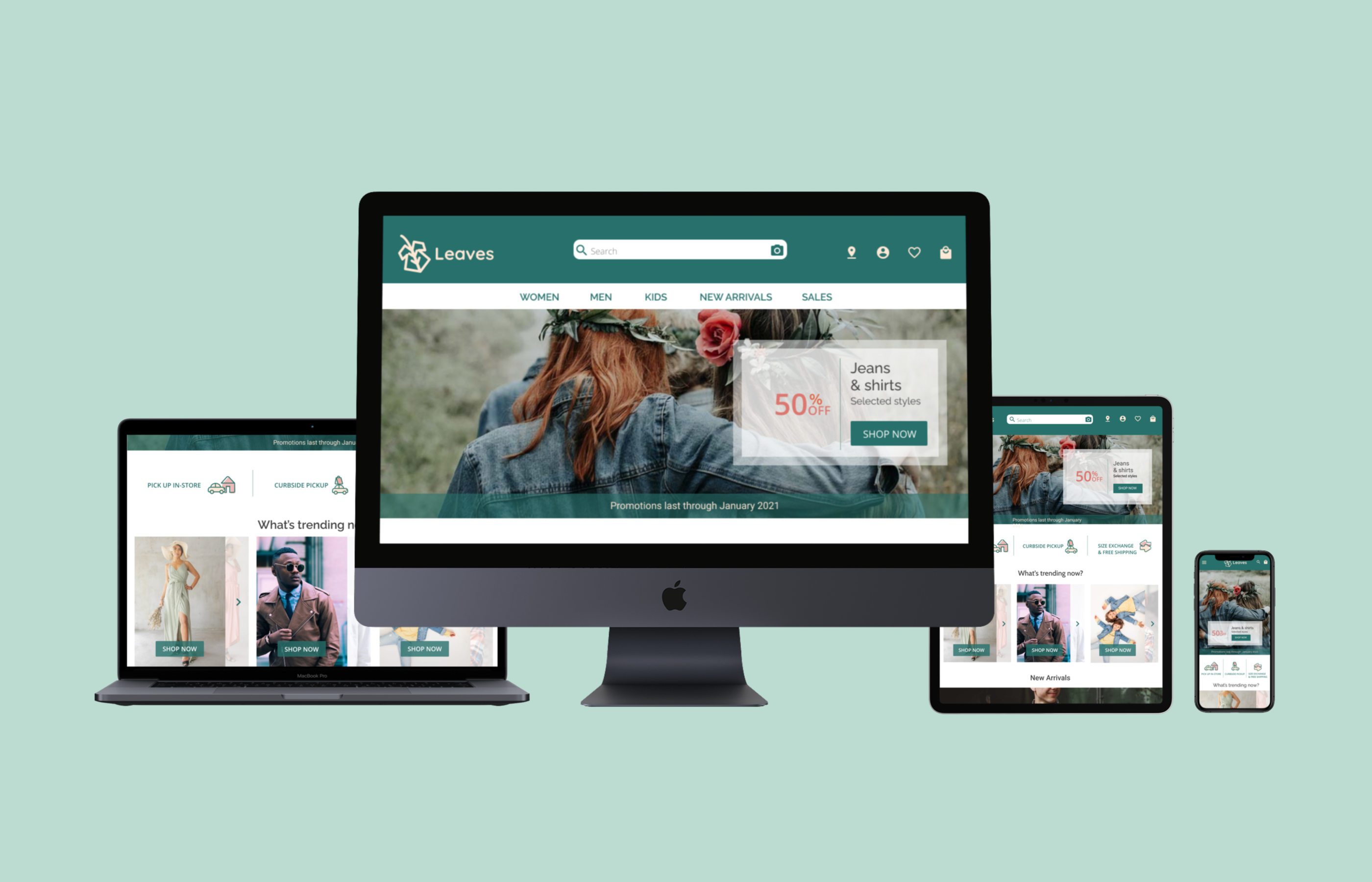
To build a responsive e-commerce website that highlights the innovative features that Leaves offers.
Responsibilities
User research, UX design, UI design, branding, prototyping, and testing.
To comprehend better the problem at hand, such as what problems do people face when shopping online? I undertook secondary research and competitive analysis as well as primary research through interviews.
Secondary Research Findings
Reward programs and subscriptions online are used to drive customer loyalty.
Increased in-store pickup and curbside pickup of e-commerce orders due to the COVID pandemic.
Online retailers are considering AR, AI, and voice recognition to enhance their customer experience.
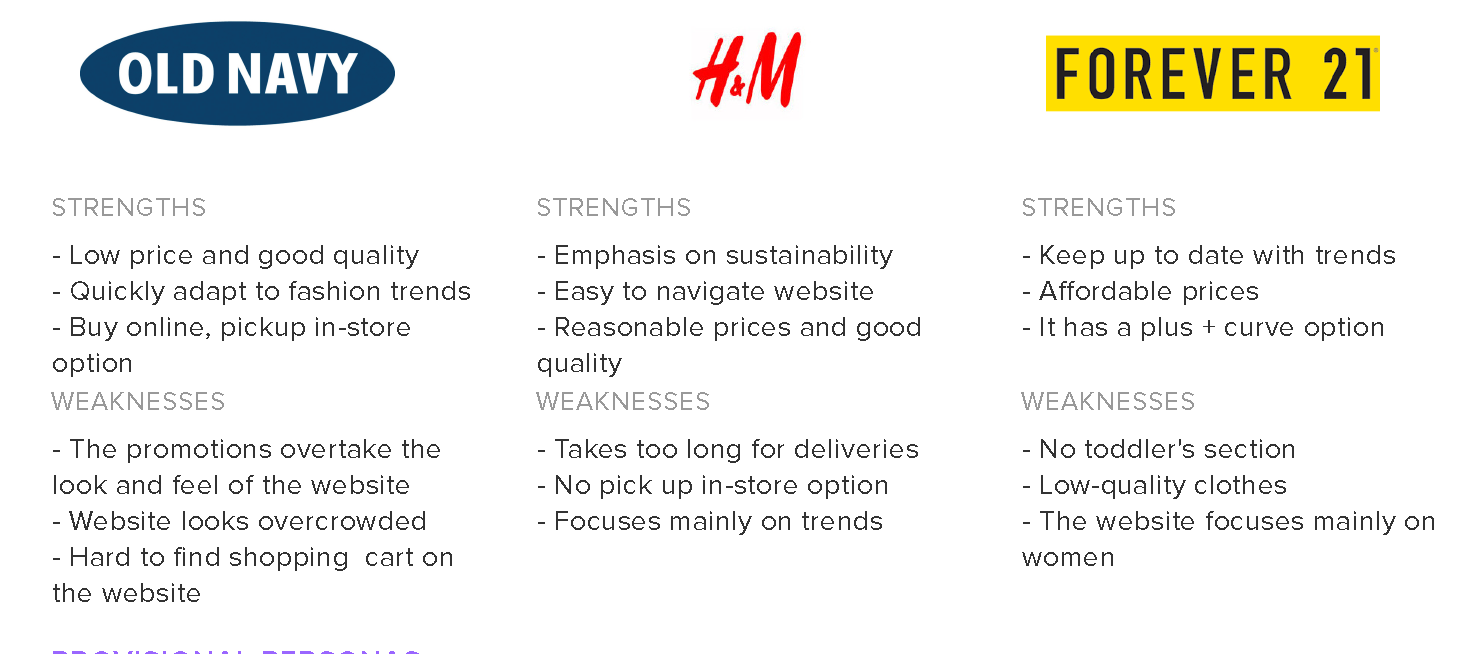
Competitive Analysis
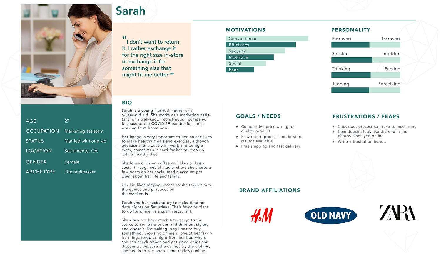
Persona
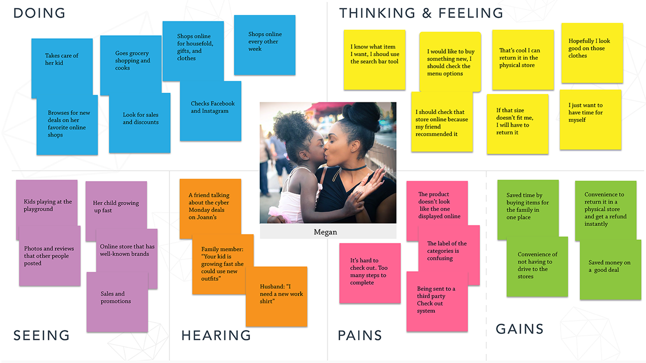
Empathy map
Interview Findings
Participants were between 25 and 45 years old.
User Goals
Competitive prices and good quality products
Easy return process and in-store returns
Discounts and sales
Free shipping and fast delivery
Exchange sizes in physical stores
User Needs
Brief purchasing process
Reviews from other people that bought the product
Good customer support
User Frustrations
The homepage is too busy with photos and links
The company’s promotional ads are annoying
The checkout process can be frustrating
Uncommon labels
The Problem Statement
Leaves’ users need to be able to find, pick, and purchase the items that they are looking for in a few steps and have easy access to relevant information about the products.
Information Architecture
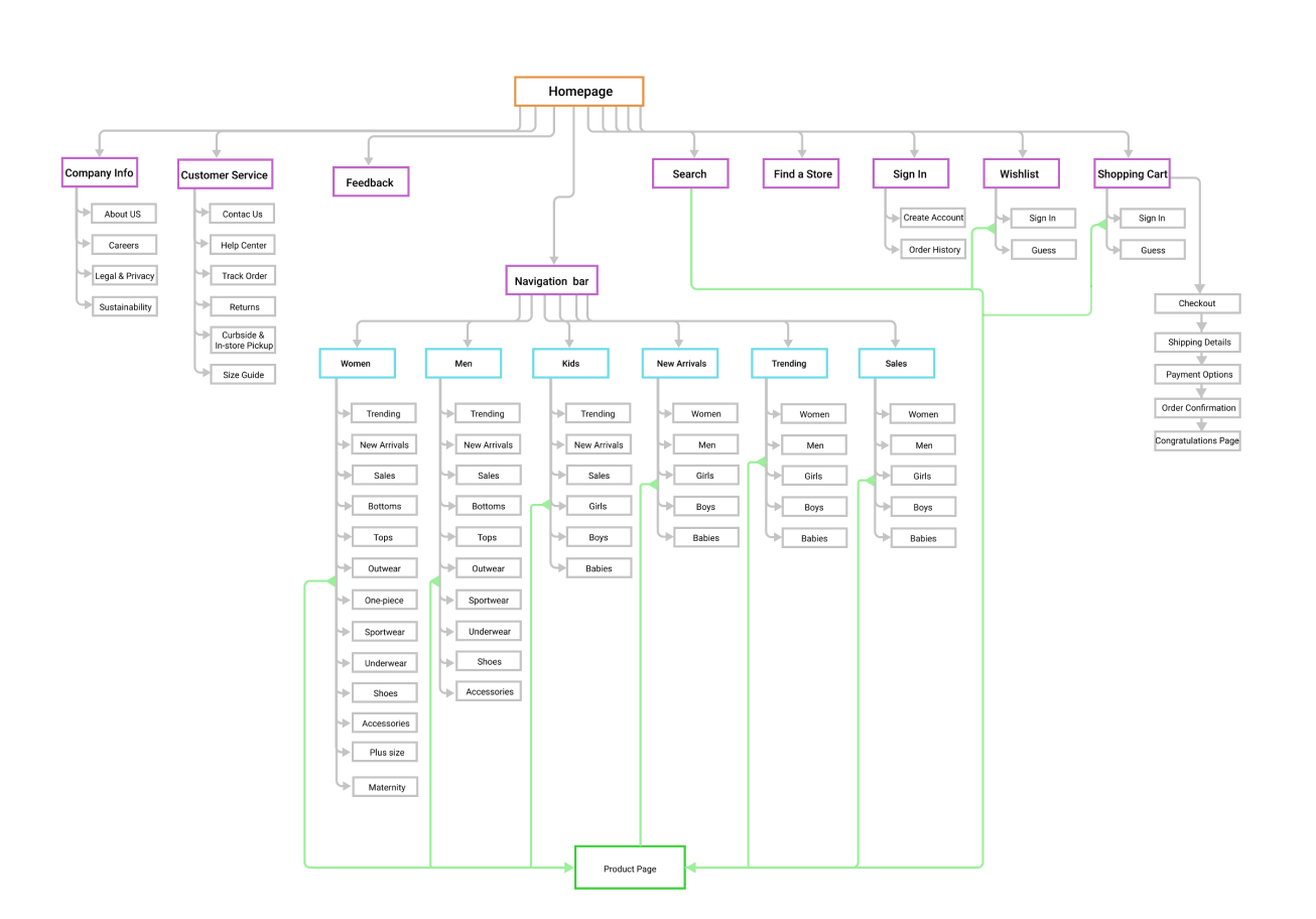
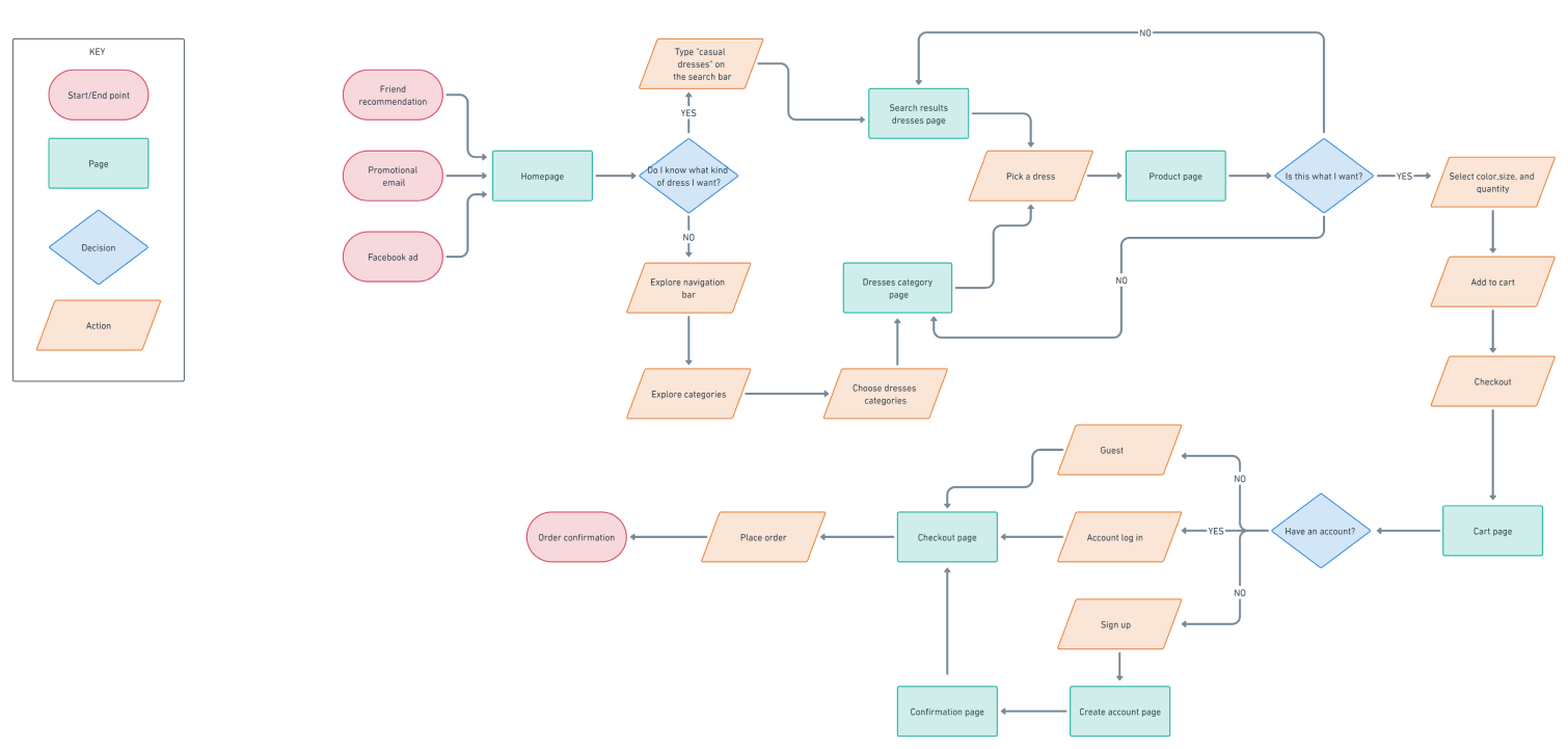
In order to help users to find the items on the e-commerce site and build the navigation of the website, I had to organize the content and design a structure. Therefore, I conducted a card sorting, built a site map, and made a user flow.
Card Sorting
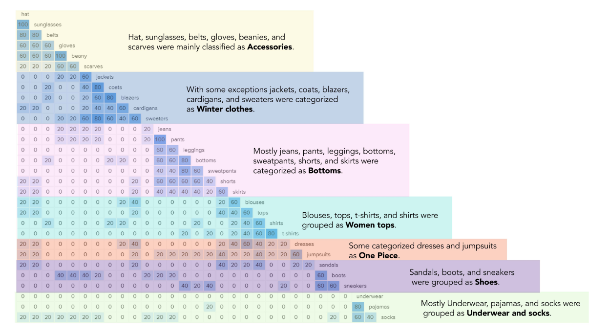
7 categories were most commonly identified: Bottoms, Winter tops, Women tops, One-piece, Shoes, Accessories, and Underwear.
Most popular category is Accessories, 60% of the participants grouped the same items under a category named Accessories.
5 uncommon categories were identified: Casual, Outerwear, Exercise, Formal, and Nightgowns.
Similarity Matrix
Sitemap
User Flow
Users use the search tool when they know what they want, and they use the main navigation when they are browsing and don’t know exactly what product or style they want.
Ideation
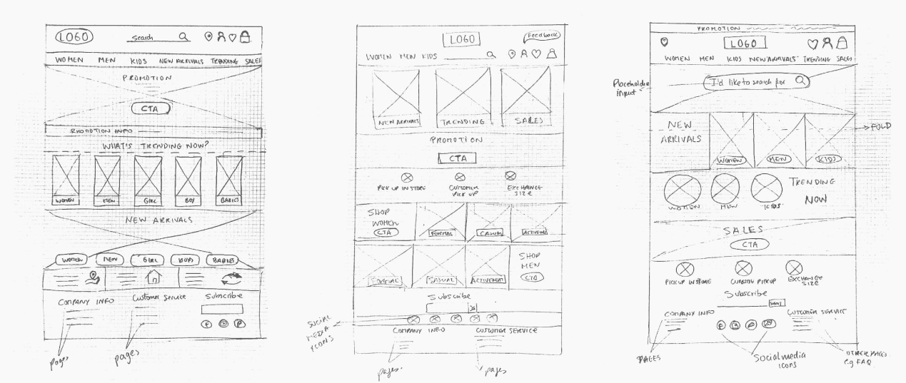
Sketches
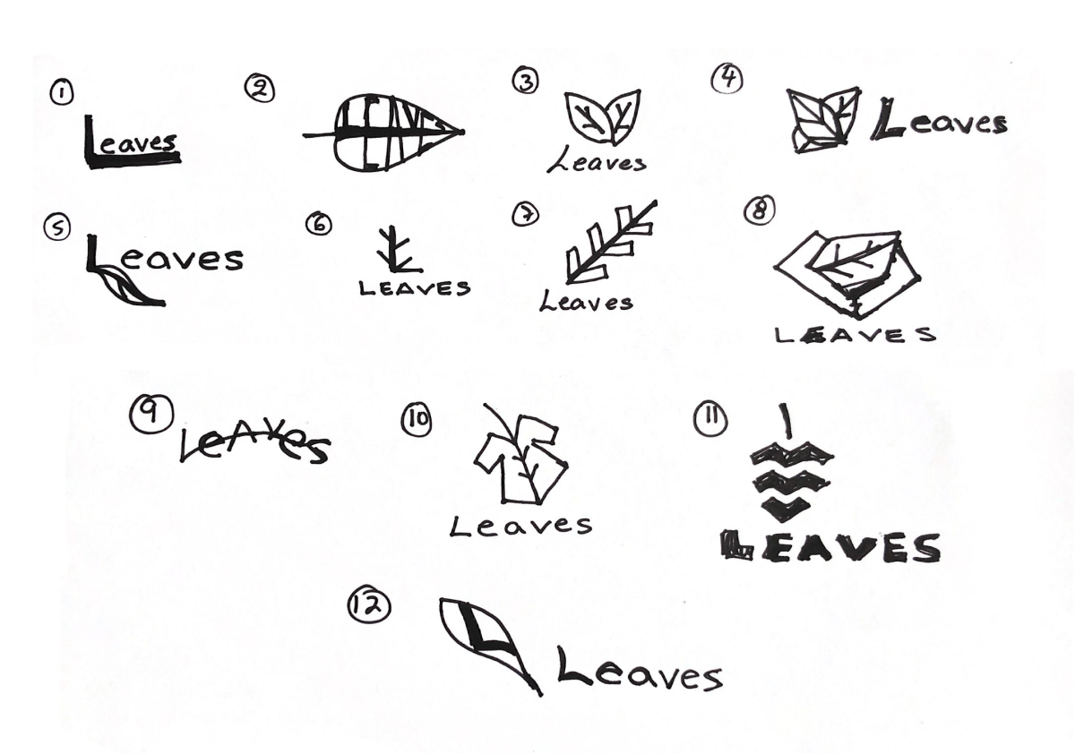
Based on the persona, card sorting, and sitemap I drew sketches with variations of the layout for the website.
Low-fi wireframes
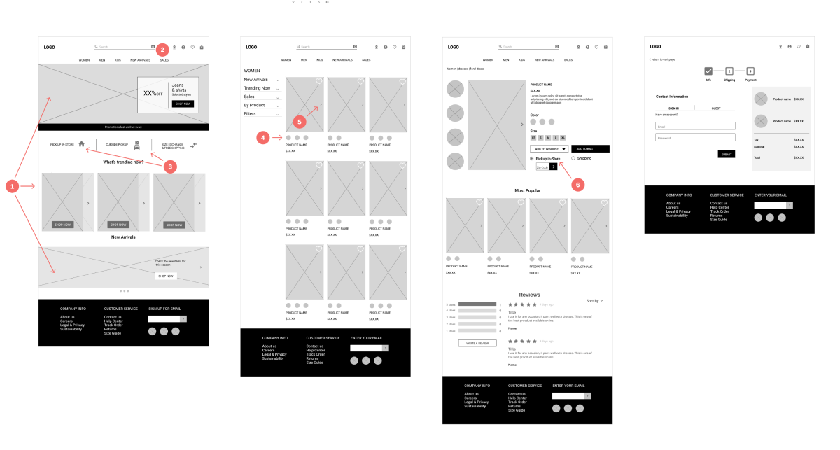
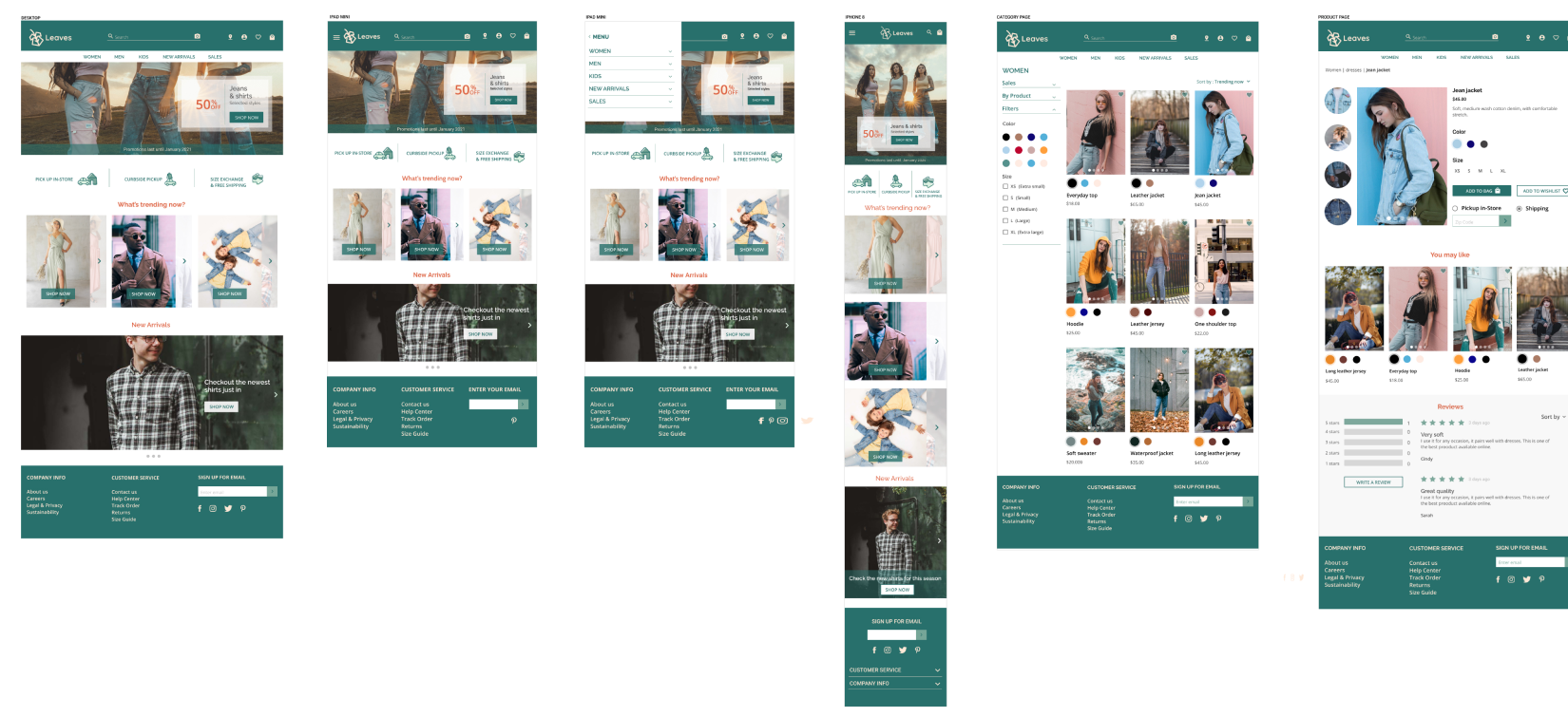
Based on my research findings, persona, information architecture and user flow, I designed wireframes for Leaves website.
HomepageThe homepage is not cluttered with images, it has the right amount of images to attract users.
New search feature
A new search tool represented by a camera icon has been added on the search bar to allow users to find an item by uploading or dragging a photo.
Services Icons
Additional services are represented with icons and text to easily be found by users.
Color Swatches
The color swatches are interactive and it allows the user to click the color and see the different colors on the item.
Product Card imagesThe user can use the arrow on the right side of the image to slide three more images of the same product that can be seen from different perspectives.
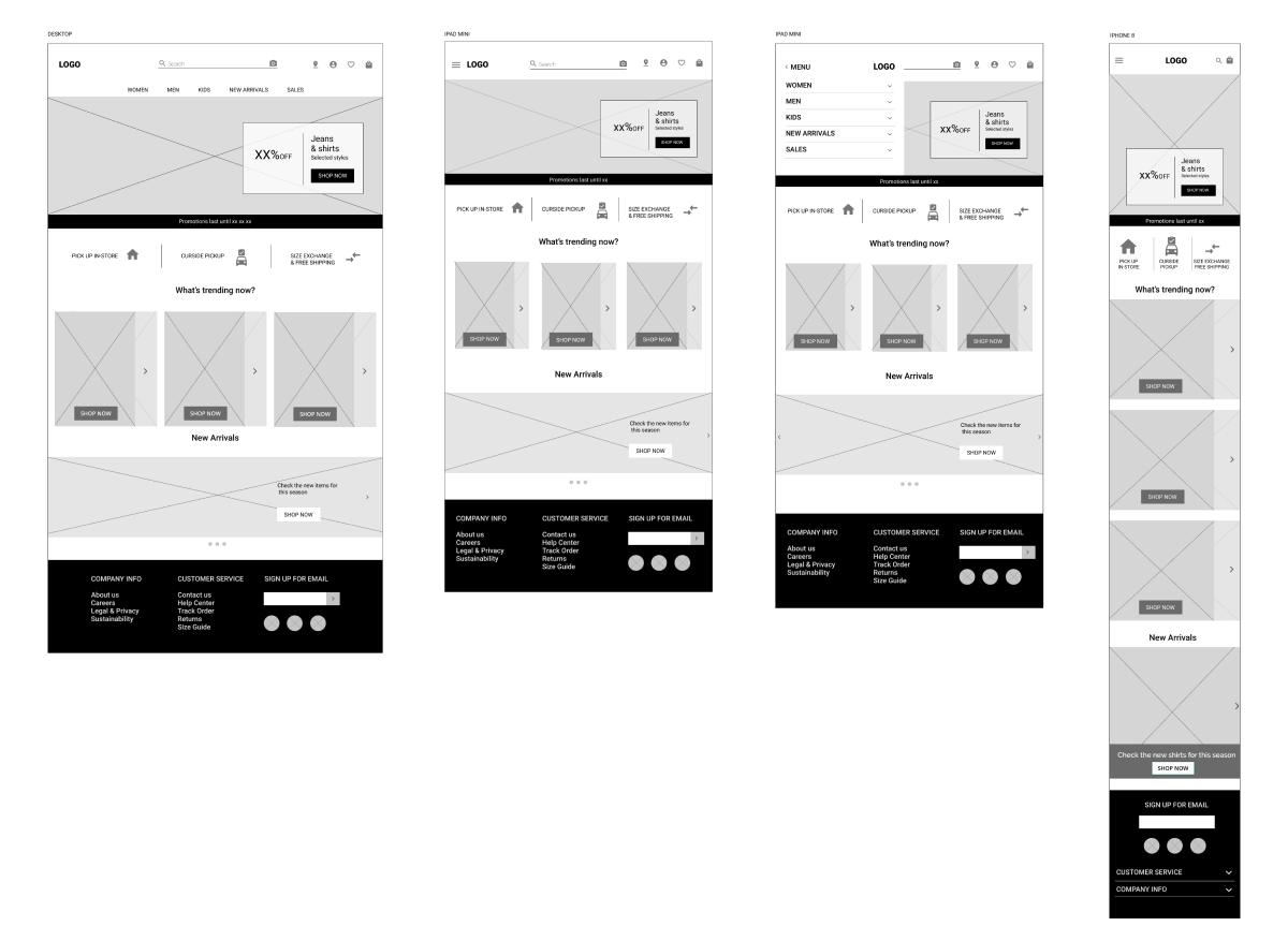
Responsive wireframes
Branding
Logo sketches
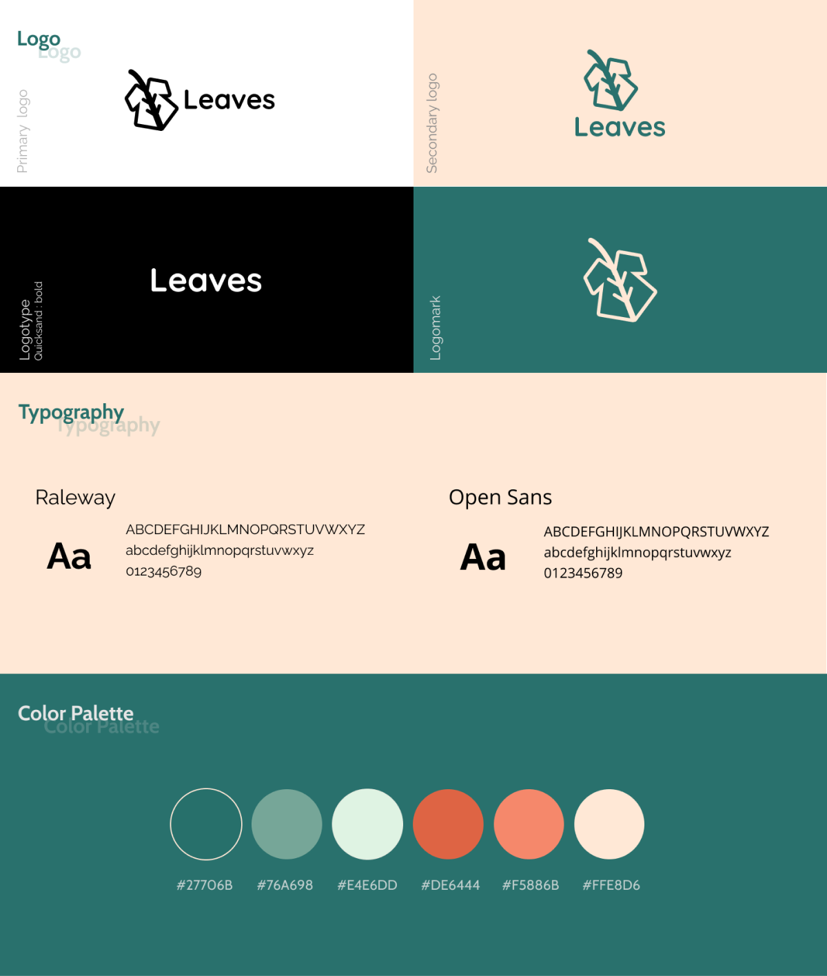
Branding decisions
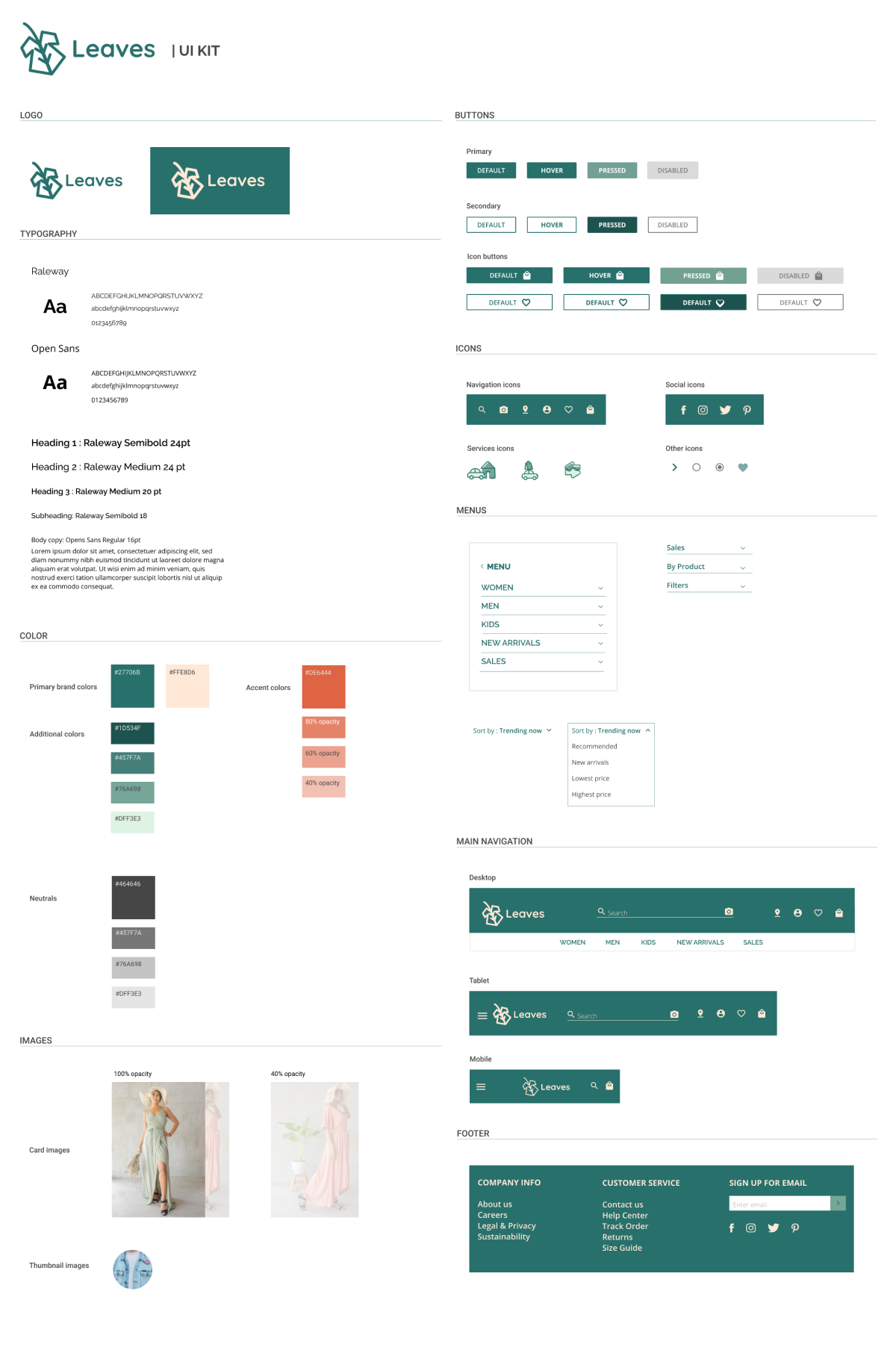
Logo This logo represents Leaves’ purpose which is to offer the best eco-friendly clothes and support environmental sustainability.
Color The green color represents calmness and nature.
Typography Two san serif fonts that pair nicely and give a fresh look to the leaves’ brand.
High Fidelity Wireframes
Usability Testing and Iteration
Methodology
Usability testing In-person and remote.
Testing Goals
Evaluate the behavior and reactions of the users when completing the tasks.
Identify pain points, opportunities, and successes.
Analyze the ease of the user flow throughout the design.
Findings
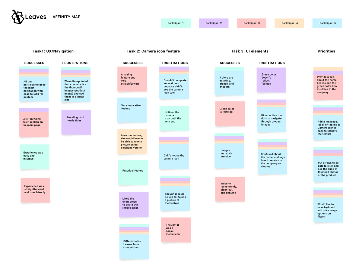
The camera icon on the search bar didn’t catch the attention of the users. Although, they said that it was a great feature.
Female users thought the icons and colors were a bit serious.
Affinity map
I organized participant’s outcomes per task, grouping them into successes and frustrations and identified priorities to be resolved.
Iterations
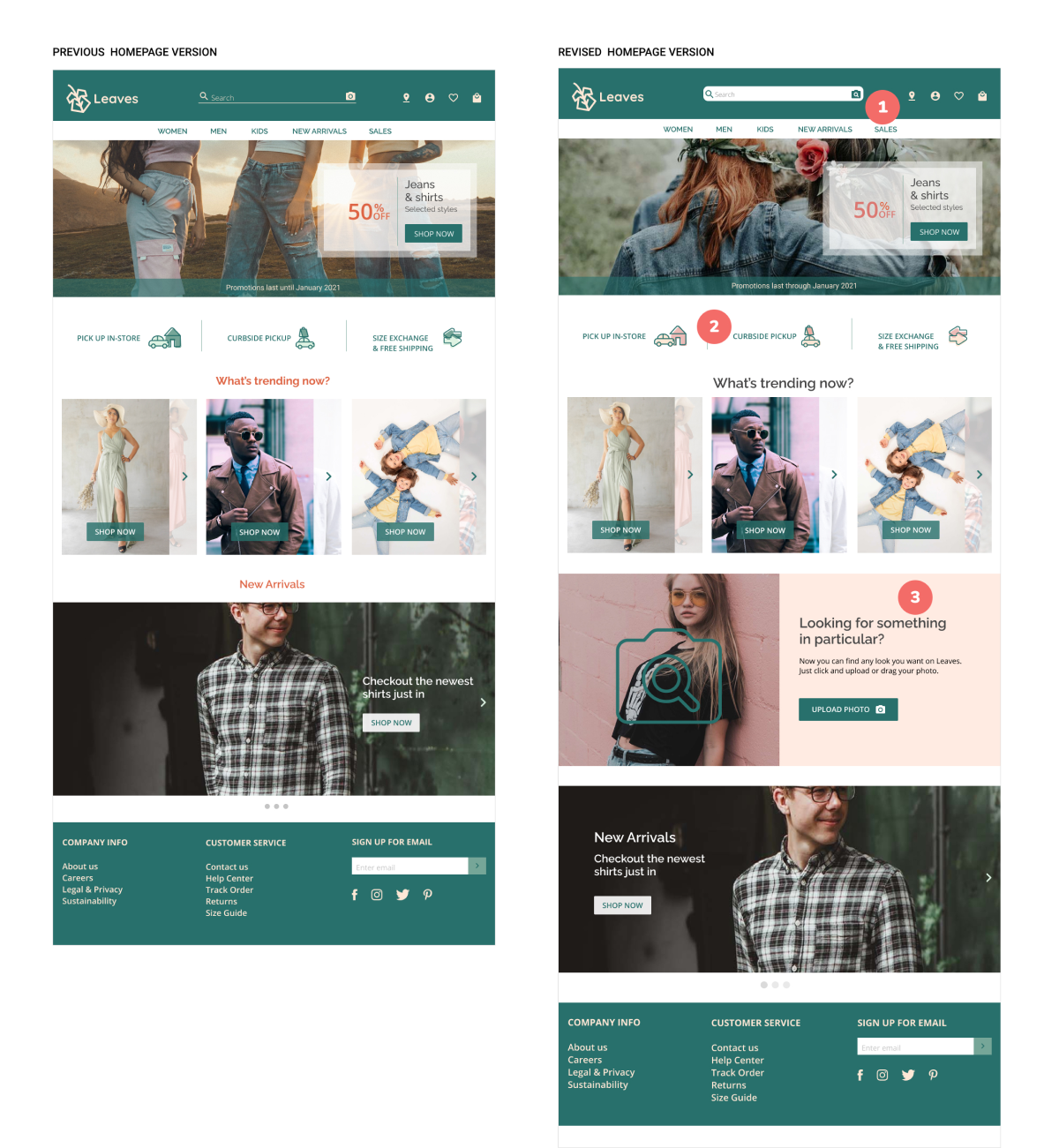
I added a a white background on the search and the upload/drag a photo search tool so it’s more noticeable.
I replaced the color orange from the color palette whit a salmon color, and changed the color on the icons to make them look more friendly.
A section on the homepage was added to invite users to check this innovative search tool.
Key Takeaways
The usability testing revealed important insights which helped to optimized the high fidelity wireframes and deliver a responsive e-commerce website to Leaves clothing store.